A visual book review of Stephen M. Stigler’s The Seven Pillars of Statistical Wisdom
After our UCLA commencement ceremony, the Statistics program gave each graduate a copy of Stephen M. Stigler’s The Seven Pillars of Statistical Wisdom as a sort of yearbook to sign amongst classmates and cement our capstone as undergraduates. Over two years later, and I finally got around to reading the book! Reviewing the so called “pillars of statistics” has grown my appreciation of its simple description of the functionality and durability of the field of Statistics (which is still in its infancy relative to most sciences). The one shortfall of the book, in my opinion, is a lack of visualizations to convey each of the 7 pillars that define the field. So, in reviewing and summarizing the book, let’s try to visualize each concept with one of my new favorite datasets: the Palmer’s Penguin dataset 1 2. The Penguins dataset contains data for 344 penguins, which were collected and made available by Dr. Kristen Gorman and the Palmer Station located at the Palmer Archipelago in Antarctica.

Aggregation
The first pillar described by Stigler is Aggregation, or the general summary of information by throwing information away!
“What do you mean throw away information, shouldn’t it all be relevant?” Well, there are many cases when changing the way we interpret information can be useful. For instance, generating the average value of a numeric field can quickly illuminate the reality of that field in relation to other fields. But to generate an average, an individual must throw away granular information for the summary. While this may seem commonplace and intuitive in today’s information age, this wasn’t always the case. The use of an average wasn’t mainstream until the 1800s, when it became a popular measurement in the earth and planetary sciences. Since then, statistical summaries that eliminate granularity for summarization have grown.
A useful visualization for determining such summary statistics is the Boxplot.
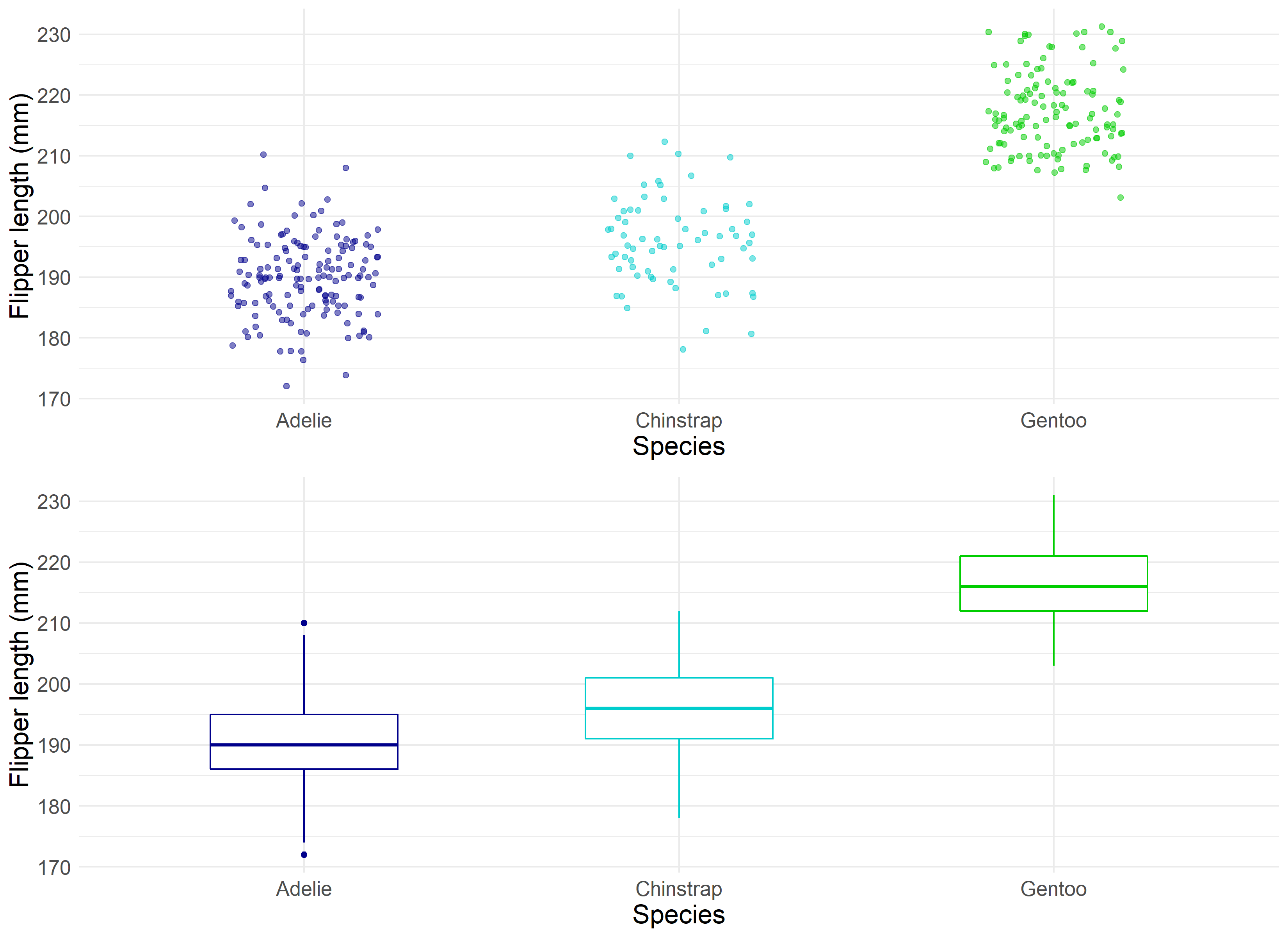
Boxplots allow statisticians to ‘boil down’ the data into a clean illustration of averages, medians, quartiles, and ranges of the underlying data. This can be useful for quick comparisons between cuts of the data, outlier diagnostics, and easier communication of the data at hand. Instead of saying “Penguins in our sample are recorded as having bill lengths of 181 mm, 186 mm, 195 mm, 207 mm…” you can say “Penguins in our sample are recorded as having an average bill length of roughly 201 mm.” This is a simple and immensely powerful tool for communicating relevant information.
Information
Speaking of information, how do we, as Stigler puts it, “measure the value and acquisition of information”? How do we determine when we have enough data, and that the data we have can accurately measure the goal of the investigation in question? This has been a challenge for researchers for a long time, dating back to when the Bank of England had to determine the accuracy of the weight and density of gold coins. At that point in time, the bank would sample coins to determine if the whole batch was accurate, to varying degrees of accuracy 4. Statisticians have since refined their methodology of sample review to develop the now famous Central Limit Theorem. The Central Limit Theorem, or CTL for short, states that as the size of the sample increases, the distribution of the mean across multiple samples will approximate a Gaussian, or “normal”, distribution. Just what does this mean?
When performing a study, multiple observations are drawn from the sample population. Additional independent observations are collected repeatedly that represent a sample of observations. When we generate an average from this sample, it will be an estimate of the average for the general population from which those samples were drawn. However, this estimated average will contain some error. What the CTL allows for is for researchers to draw multiple other samples and calculate their means, and which together those means will form a normal distribution (around the average).
CTL is impressive, as it will occur no matter the shape of the population distribution from which we are drawing samples. It demonstrates that the distribution of errors from estimating the population mean fit a distribution that the field of statistics knows a lot about.
This estimate of the Gaussian distribution will be more accurate as the size of the samples drawn from the population increases. This means that if we use our knowledge of the Gaussian distribution in general to start making inferences about the means of samples drawn from a population, that these inferences will become more useful as we increase our sample size.
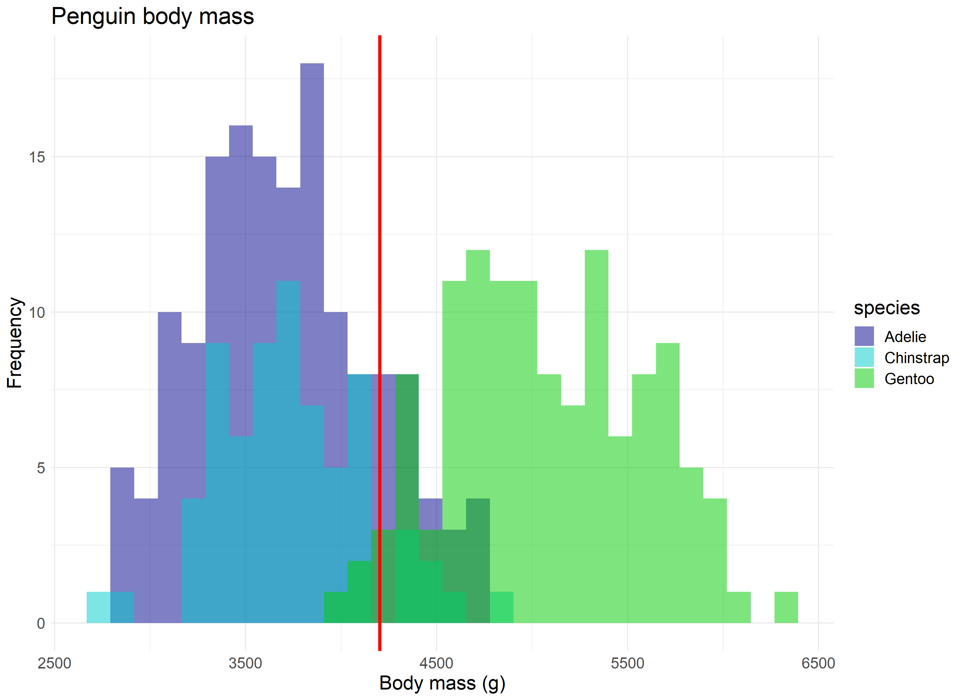
So where do we see the central limit theorem, or rather, the normal distribution it is built off of, appear in real research? Let’s assume we are curious to know the average body mass of penguins in our study, regardless of species. We have the luxury of having a large sample size which pinpoints an average body mass of roughly 4,200 grams.
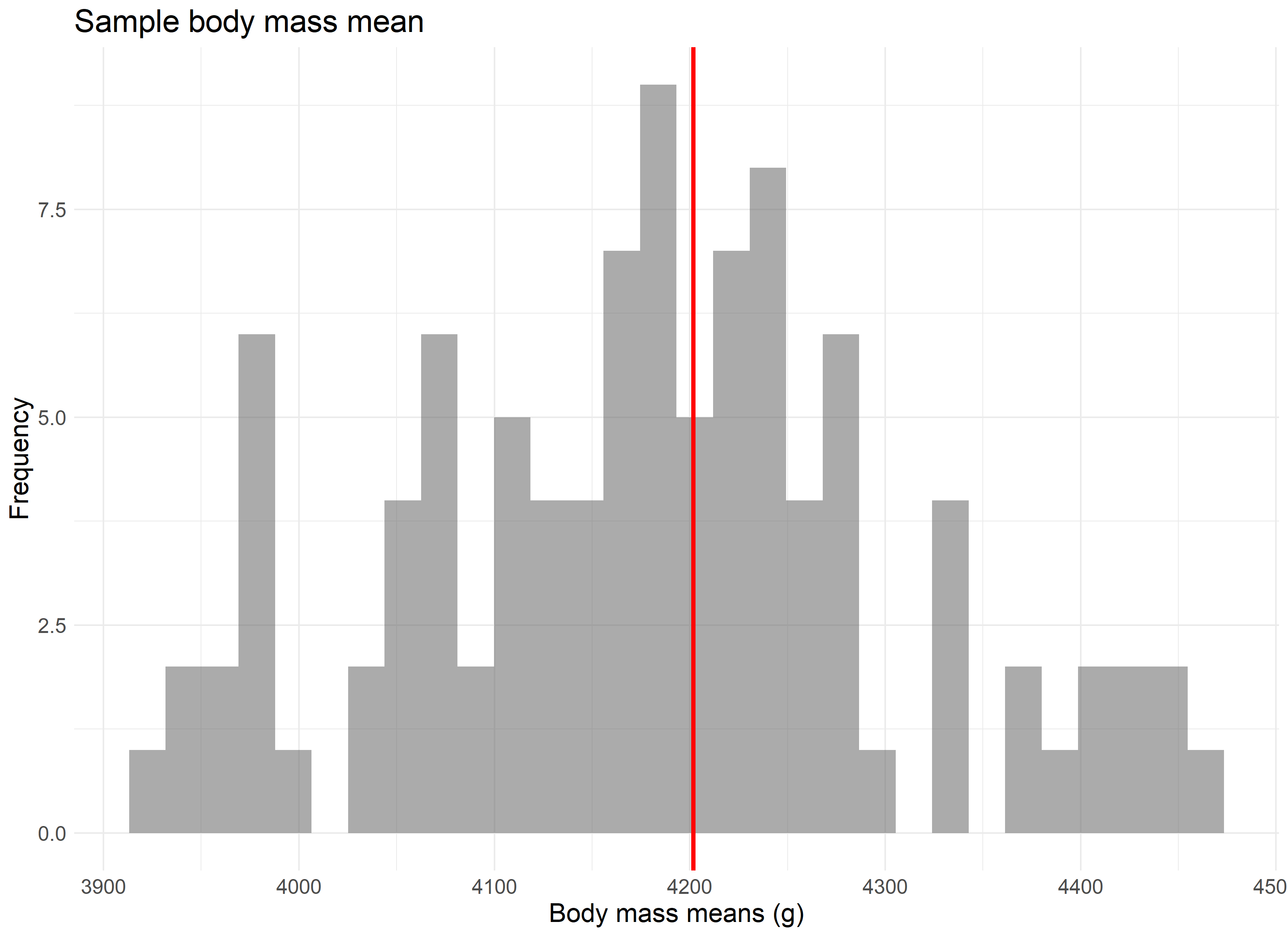
But let’s assume we didn’t have our data, and that the 344 penguins in our study represent all the penguins available in the population. Now imagine that 100 different research teams had, independently, traveled to Antarctica and gathered data for 30 penguins each from our population, and then calculated an average body mass for their group of penguins. If we were to take each of those average values and combine them, they would still accurately produce the average body mass of 4,200 grams, as seen in the randomly sampled version of this concept below.
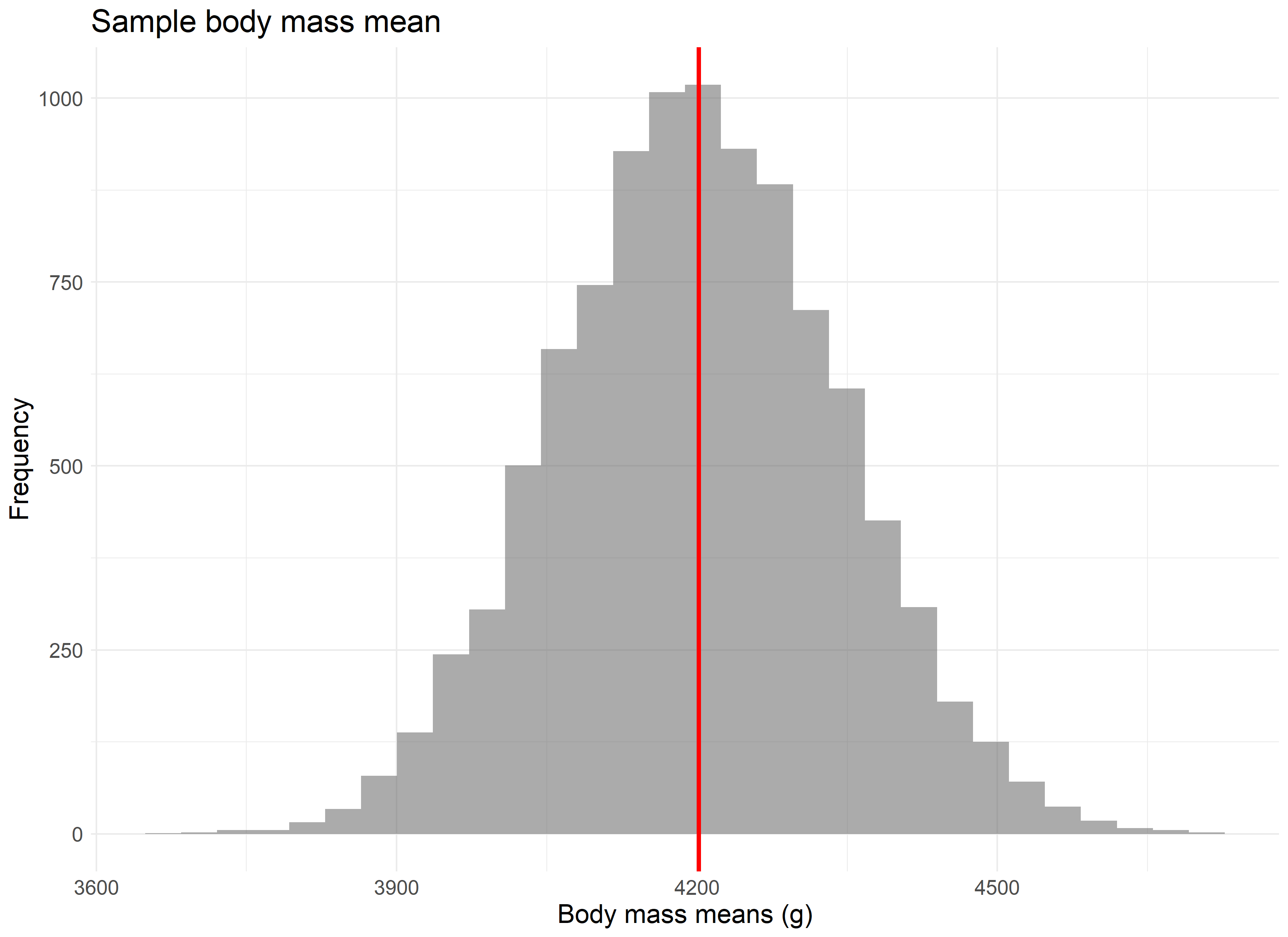
The point is best driven home if we were to repeat this experiment not 100 times, but 10,000 times. The larger the number of repeated samples, the closer we get to not only a normal distribution, but a normal distribution centered on the population’s average value.
Likelihood
“A measurement with no context is just a number” Stigler writes to start out his chapter on Likelihood. Probability distributions are one of many ways to provide such context. They are used to summarize the probabilities of possible values of a random variable, as well as to calculate the confidence intervals for parameters involved in hypothesis testing. Bayesian statisticians use probability distributions to define prior and posterior distributions for hypothesis testing. Two common ways of approaching probability distributions include probability density functions (PDF) and cumulative distribution functions (CDF).
The shape of a histogram of most random samples will match a well-known probability distribution. Common distributions are ‘common’ because they occur again and again in different and sometimes unexpected domains. Determining the type of distribution is useful when you need to know which outcomes are most likely, the spread of potential values, and the likelihood of different results.
In this situation, the Penguin research team that produced our data collected “Delta13C and Delta15N SI signatures of blood tissue, obtained during egg laying.” The Delta 15 N values from the blood samples were helpful in testing the amount of Nitrogen in the biome, which can aid in indicating the foraging and /or dieting behaviors and niches that male and female penguins might occupy 5.
Let’s consider a scenario where a researcher comes across a Delta 15 N value of 9. What is the probability of finding a value greater than 9 in our population? Rather, can we determine how rare a chance this value occurs in our data?
First, we need to fit a distribution to our data - visualized as a histogram below. We can use this visual to try to match which distributions fit best.
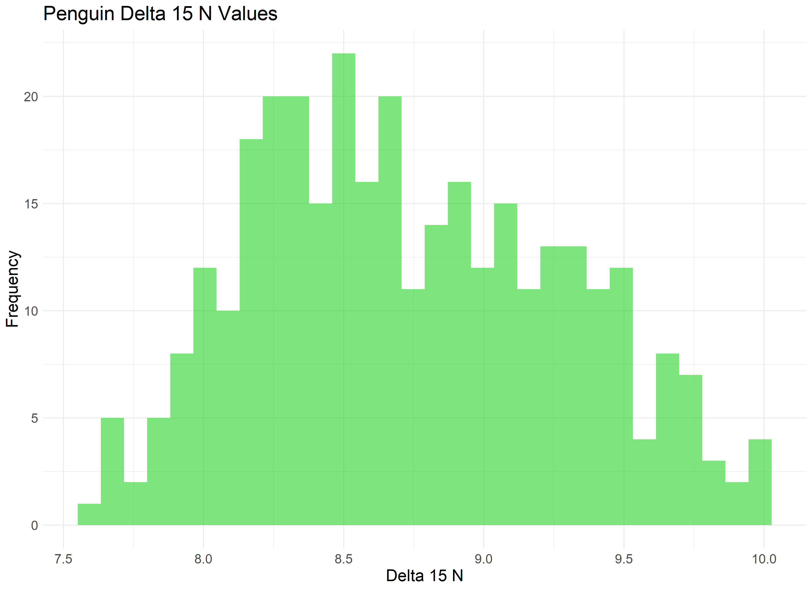
Our data appears to be somewhat normal with a skew towards the right. A version of the Gamma distribution seems like a solid contender, as well as some additional distributions often found in the life sciences, such as the Weibull distribution.
We’ll use the fitditrplus package in R to test several of these probability distributions against our data. The package lets us first review potential fits based on common models, which we can then fit to the data ourselves and review their criteria and diagnostic plots. Upon review, we produce the following QQ plot and summary statistics associated with the Weibull, Log Logistic, and Generalized Gamma distributions.
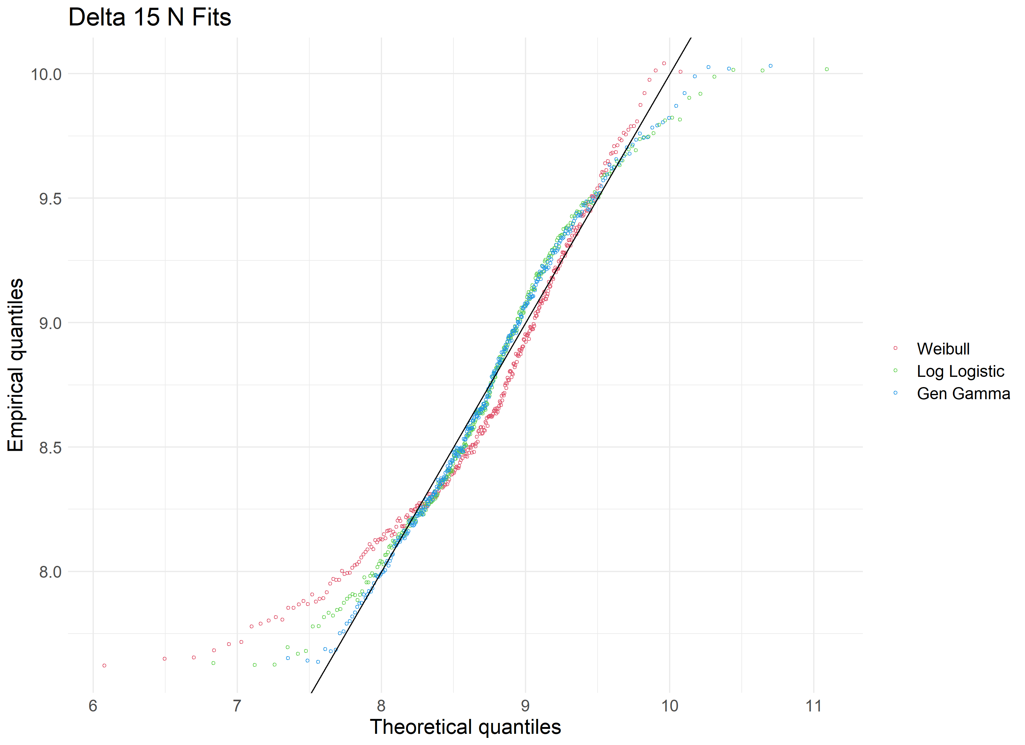
| Modeled Distribution | AIC | Kolmogorov-Smirnow statistic |
|---|---|---|
| Weibull | 587.32 | 0.0997 |
| Log Logistic | 564.00 | 0.0594 |
| Gen Gamma | 543.64 | 0.0498 |
Reviewing our tested distributions, we find that a Generalized Gamma (GenGamma) distribution fits our data best. This can be determined by optimizing for a high AIC value and low Kolmogorov-Smirnov value, both of which are statistics used to find the distribution of best fit. In addition, a visual review of the above QQ plot lets us determine how best the distribution fits to our data, and how it accounts for outliers.
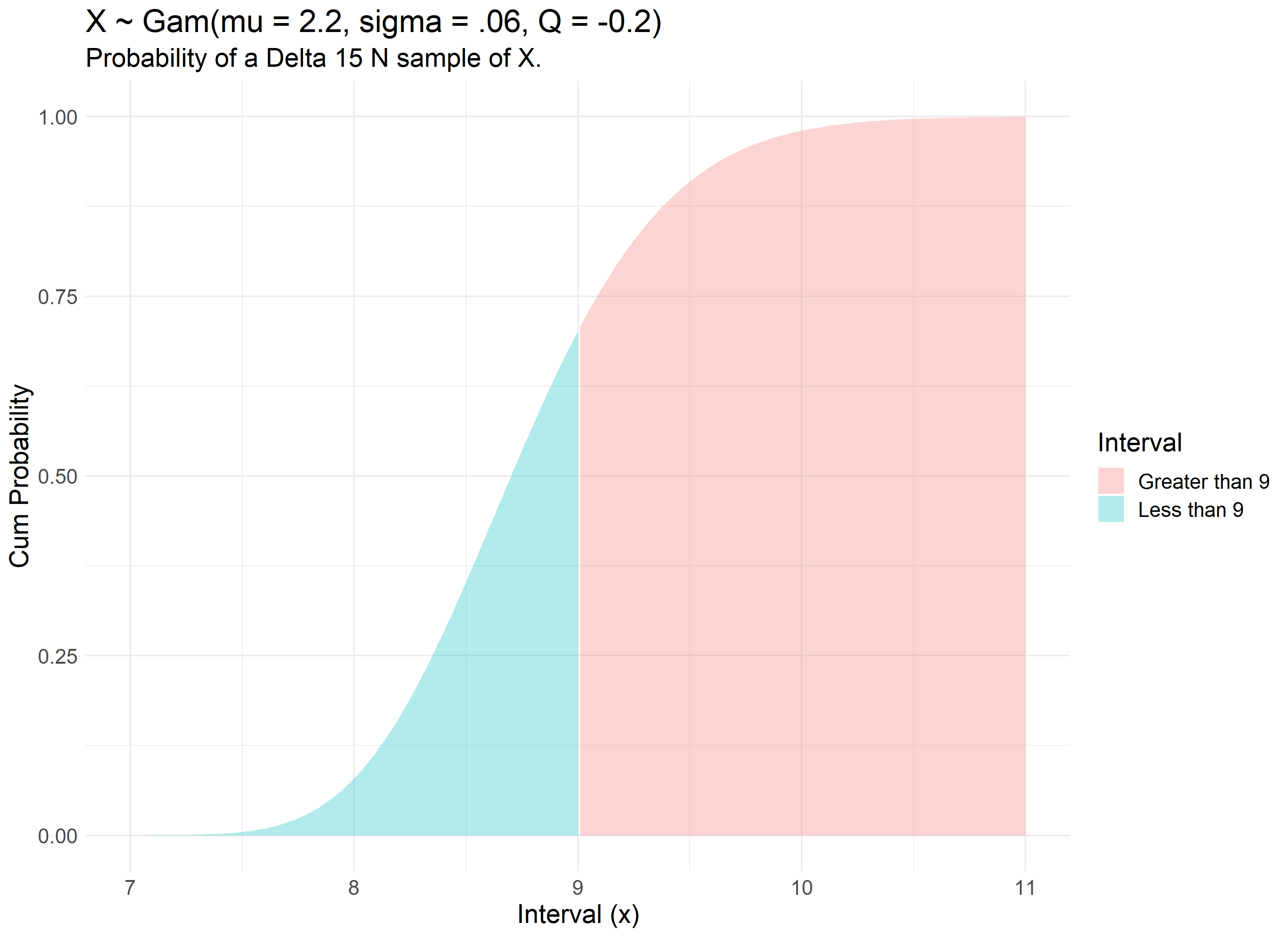
With a fit distribution, we can now utilize it’s underlying parameters to answer our question. The R command ‘pgengamma’ allows us to enter in our distribution’s parameters and find the probability associated with a specific value.
pgengamma(9, mu = 2.159, sigma = 0.0622, Q= -0.210, log = FALSE, lower.tail = TRUE)
Therefore, our review finds that there is a 70% chance of a Delta 15 N value of less than 9. We can visualize this concept with the use of the Generalized Gamma’s Cumulative Distribution Function modeled with our dataset.
Intercomparison
Statisticians are often tasked with determining the differences between specified populations. A powerful application of this differentiation is the concept that it can be done internally, or rather, without the reference of exterior criteria. The idea was first prominent with Francis Galton’s famous essay “Statistics by Intercomparison” in 1875 6, but didn’t find practical application until William Gosset published the now famous Student’s t-test in “The Probable Error of a Mean” in 1908 7. While employed as a chemist for the Guinness Company 8, Gosset was interested in analyzing problems of small samples, say the quality control of a new beer recipe that has only been made six times. Gosset remarks that “any series of experiments is only of value in so far as it enables us to form a judgment as to the statistical content of the population to which the experiment belongs.” The key point being that the goal was to not rely on any exterior industry standards for what counted as a ‘significant difference’.
The underlying mathematics of the Student’s t-test stayed consistent, later being refined by Ronald A. Fisher, and eventually culminating in tests such as the Two-Sample T-Test:
\[t = \frac{\bar{x}_1 - \bar{x}_2}{\sqrt{s^2 (\frac{1}{n_1} + \frac{1}{n_2})}}\]Where $ \bar{x}_1 $ and $ \bar{x}_2 $ are the sample means, $s²$ is the pooled sample variance, $n_1$ and $n_2$ are the sample sizes and $t$ is a Student t quantile with $n_1 + n_2 - 2$ degrees of freedom.
The two-sample t-test, as presented above, allows the comparison of the means from two data sets. The t-test is useful in that it can be used when our data set is small, namely less than 30 observations, while still being useful if our data grows large. The t-test does require an assumption that the data are drawn from a normally distributed population, and that the groups drawn have roughly the same variance. The test works by comparing the number of standard deviations between groups based on the amount of data present. The less data available, the more of a difference that is required to assume that a significant difference was secured.
In our modern era, intercomparison is used in the application of A/B testing and general population comparisons. While we often have plenty of data to work with and assume normality from, there are times when data isn’t readily available. For instance, let’s assume that we only had 12 female and 12 male penguins available in our study. Let’s pose the question: is there a significant difference between the bill length of female and male penguins? We can randomly draw 24 observations from our data and calculate the summary statistics as follows:
| Group | Count | Mean | Standard Deviation | Female | 12 | 40.9 | 4.58 | </tr>Male | 12 | 46.2 | 5.27 | </tr>
|---|
We see that our means do appear different and that our standard deviation is similar within one standard deviation. We can visualize these results to confirm our understanding.
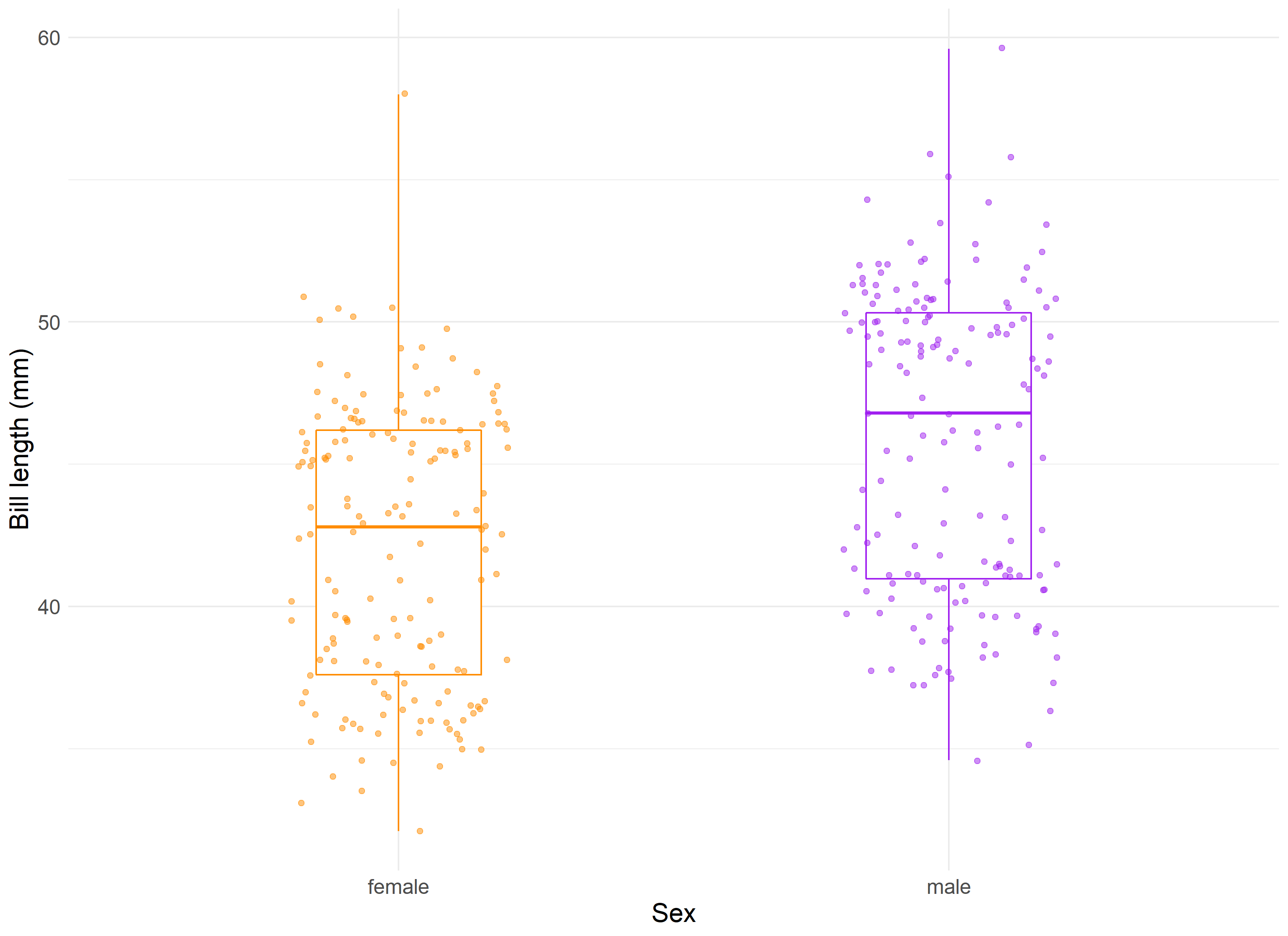
Given this, we can compute a two-sample t-test which provides us with a t-value of -2.6 and p-value of 0.016. This is a significant finding and helps prove what we already knew: that the bills of female and male penguins do differ by a significant margin.
Regression
Prediction is a main component of modern data science, where intricate machine learning models are used to classify and evaluate future results based on prior data. The concept of building a model that allows us to compare predicted results to the expected results was originally formed by Galton in 1885, where he first defined the term “regression”. In his analysis of child and parent height data, Galton introduced the concept of individual data points ‘regressing to the average’, exemplified where parents of above average height tended to produce shorter children, and parents of below average height tended to produce taller children.
Predictive models, ranging in complexity from simple linear regression to neural networks, allow us to utilize the concept that groups within data tend to produce variation of varying but predictable definitions. For instance, offspring can vary in height that is often directly correlated to the height of their parents, in within a specific degree of variability is seen and typically benchmarked by the offspring’s sex. The situation of one’s height cannot be confidently predicted by parent’s height alone, but with a combination of factors (genetic, environmental, etc.) that can improve this confidence and increase the probability of ‘regressing’ to a mean that closely resembles the population we want to model.
For illustration, we can replicate a model performed by the Penguins research team. One main goal of their team’s research was evaluating a penguin’s sex based on its physical characteristics. This sort of research question is a great case example for a logistic regression model, which allows us (and the research team) to determine and evaluate a binary classification of the data, in this case Male (1) vs Female (0). In the study notes 9, penguins are controlled by species, and then a mix of numerical variables such as culmen length, flipper length, and body mass are used. Reviewing the researcher’s notes, we can create a simplified version of the Chinstrap penguin model, and try to predict sex based on just their culmen length, better known as bill length.
Let’s visualize what a logistic regression would appear like when applied to our data:
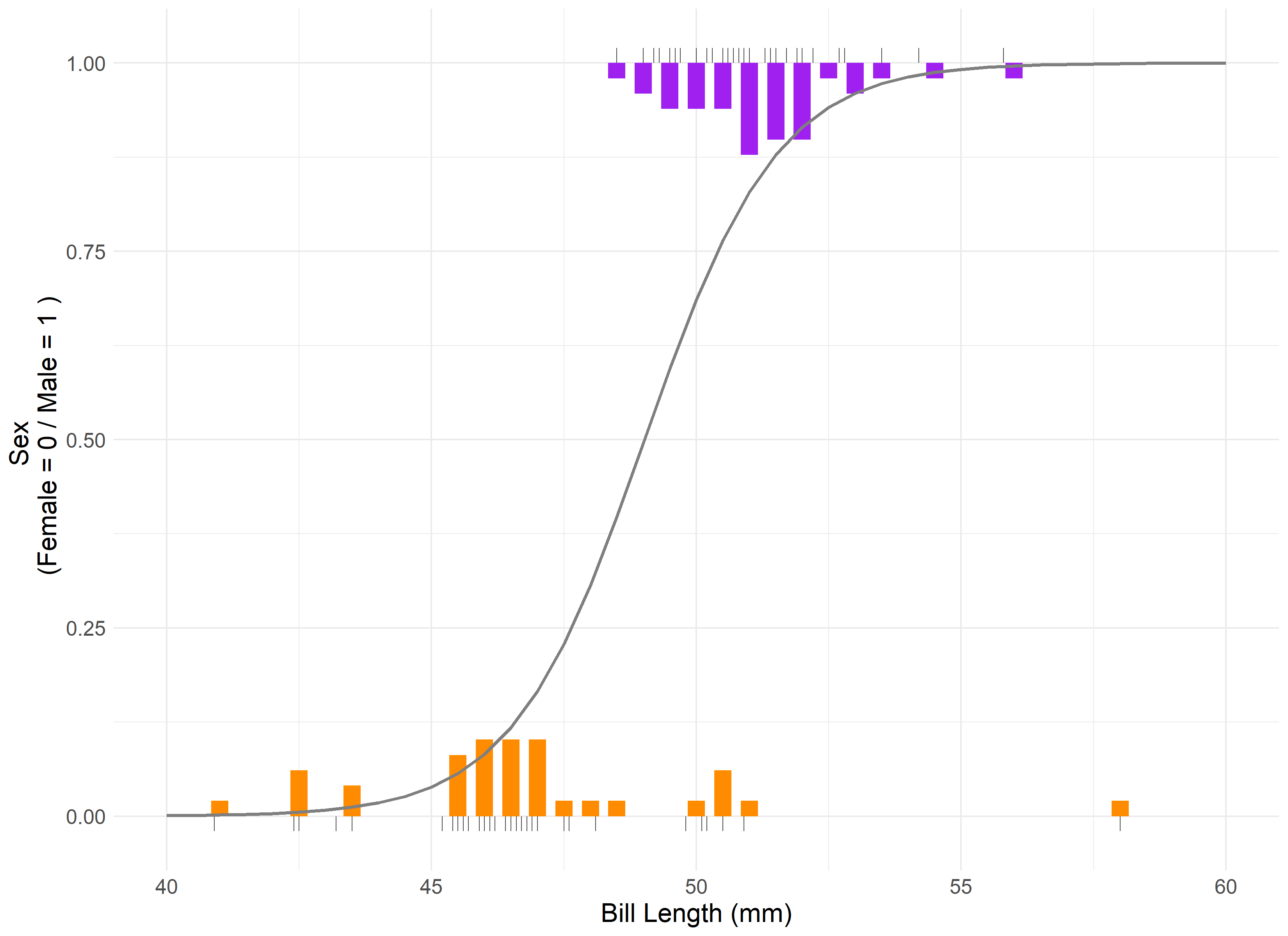
Our model’s assumptions are met, albeit with a single outlier being present in the residual and QQ plots. The results indicate that bill length is statistically significant in its correlation to the sex of the penguin. The intercept for our model is 2.22. Therefore, we can say that on average, for a 1 mm increase in chinstrap penguin bill length, the odds of being a male chinstrap penguin increase by a factor of 2.22.
A reminder that correlation is not causation and this is not a direct causal relationship. For instance, being born with an abnormally large bill doesn’t imply that a penguin will be male. Rather, males on average have larger bills, and we can use that metric to explain the difference in the groups.
Design
Structure is a crucial component of any scientific endeavor. The design(s) implemented into a research project are key to providing controlled and replicable results being achieved. In experimental designs, the use of blocking factors and randomization are essential features for ensuring statistical assumptions can be met. The late statistician David Cox is quoted as describing randomness as “a device for eliminating biases, for example from unobserved explanatory variables and selection effects; as a basis for estimating standard errors; and as a foundation for formally exact significance tests.” 10 Randomness, or rather controlled randomness, is what allows us to discern meaningful results from the often-limited data we can collect.
The Penguin research team practiced good design qualities when they produced their research data. The study was pre-planned to examine “ecological sexual dimorphism among… penguins asking whether environmental variability is associated with differences in male and female pre-breeding foraging niche.”
Dr. Kristen Gorman and their team collected samples from three different island populations over the course of three years. This stratification by species, island location, and time eliminates bias and error, which allows for the study of these individual effects. These images from the study demonstrate the execution of these results.

Furthermore, we can break out the data by feature to examine just what blocking was conducted.
| Species | Island | Year | Count |
|---|---|---|---|
| Adelie | Torgersen | 2007 | 19 |
| Adelie | Biscoe | 2007 | 10 |
| Adelie | Dream | 2007 | 20 |
| Adelie | Biscoe | 2008 | 18 |
| Adelie | Torgersen | 2008 | 16 |
| Adelie | Dream | 2008 | 16 |
| Adelie | Biscoe | 2009 | 16 |
| Adelie | Torgersen | 2009 | 16 |
| Adelie | Dream | 2009 | 20 |
| Gentoo | Biscoe | 2007 | 34 |
| Gentoo | Biscoe | 2008 | 46 |
| Gentoo | Biscoe | 2009 | 43 |
| Chinstrap | Dream | 2007 | 26 |
| Chinstrap | Dream | 2008 | 18 |
| Chinstrap | Dream | 2009 | 24 |
As can be noted, a minimum of 10 penguins per blocking group was maintained throughout the study. This was done in light of challenges faced by the study group, which they detailed in the study:
-
“The reduced sample size for chinstraps was due to the overall smaller number of individuals breeding at rookeries on Dream Island.”
-
“These sample sizes are reduced in comparison with the original number of study nests marked and monitored per species as at times weather conditions hindered rookery access resulting in some study nests not being sampled if the pair had already reached clutch completion.”
-
“some pairs were excluded from statistical analyses because a final egg was never observed at the nest”
While natural limitations prevented perfect even cuts of data being available per blocking group, the design and sample sizes still allow for us to control for excess randomness caused by these features and eliminate a significant amount of their impact on the overarching study.
Residual
The last pillar deals with the comparison of expectations to reality. A residual is the difference between the predicted and actual result in an inference model. The evaluation of residuals can be understood as the evaluation of the success of the model itself. Residuals can be plotted and reviewed to determine that not only our model assumptions are being maintained, but that the results of our model are accurate enough for our purposes.
Let’s create one last hypothetical situation: assume we are the Penguin research team, and the scale we use to measure the body mass breaks! We still have 86 penguins to go, and don’t have time to find a replacement. How can we determine the final penguin’s weight before leaving Antarctica for the season? Well, it’s not perfect, but we can attempt to fill our null data with predicted results based on the flipper length, sex, and species of the penguin from our already collected data.

Of the 86 penguins we theoretically couldn’t weigh, we were within 10% of their actual weight for 61 of them, or roughly 3/4 of the missing weight population. These residuals allow us to review our model and determine that while this can inform our understanding of a reasonable weight for these penguins, we should be cognizant that some won’t line up to reality.
Conclusion
Statistics is a field of varying methodologies and techniques that attempt to give us a better understanding of our world through the data we collect and analyze. The seven pillars that form its foundation provide us with a concrete understanding of how to build, interpret, and model information for our own understanding of the world.
Many topics are posited by Stigler as the future ‘8th’ Pillar of Statistics. Causal inference, best described by Judea Pearl in the “The Book of Why”, is in my opinion, a potential candidate for that title. But more on that in a future post!
Footnotes & Citations
-
Horst AM, Hill AP, Gorman KB (2020). palmerpenguins: Palmer Archipelago (Antarctica) penguin data. R package version 0.1.0. https://allisonhorst.github.io/palmerpenguins/. doi:10.5281/zenodo.3960218. ↩
-
The Palmer’s Penguins dataset has become a common replacement for the widespread IRIS dataset, which has in recent years been ‘canceled’ by many statisticians due to a growing understand of the unfavorable political views its creator, Ronald Fisher, had (i.e. eugenics). ↩
-
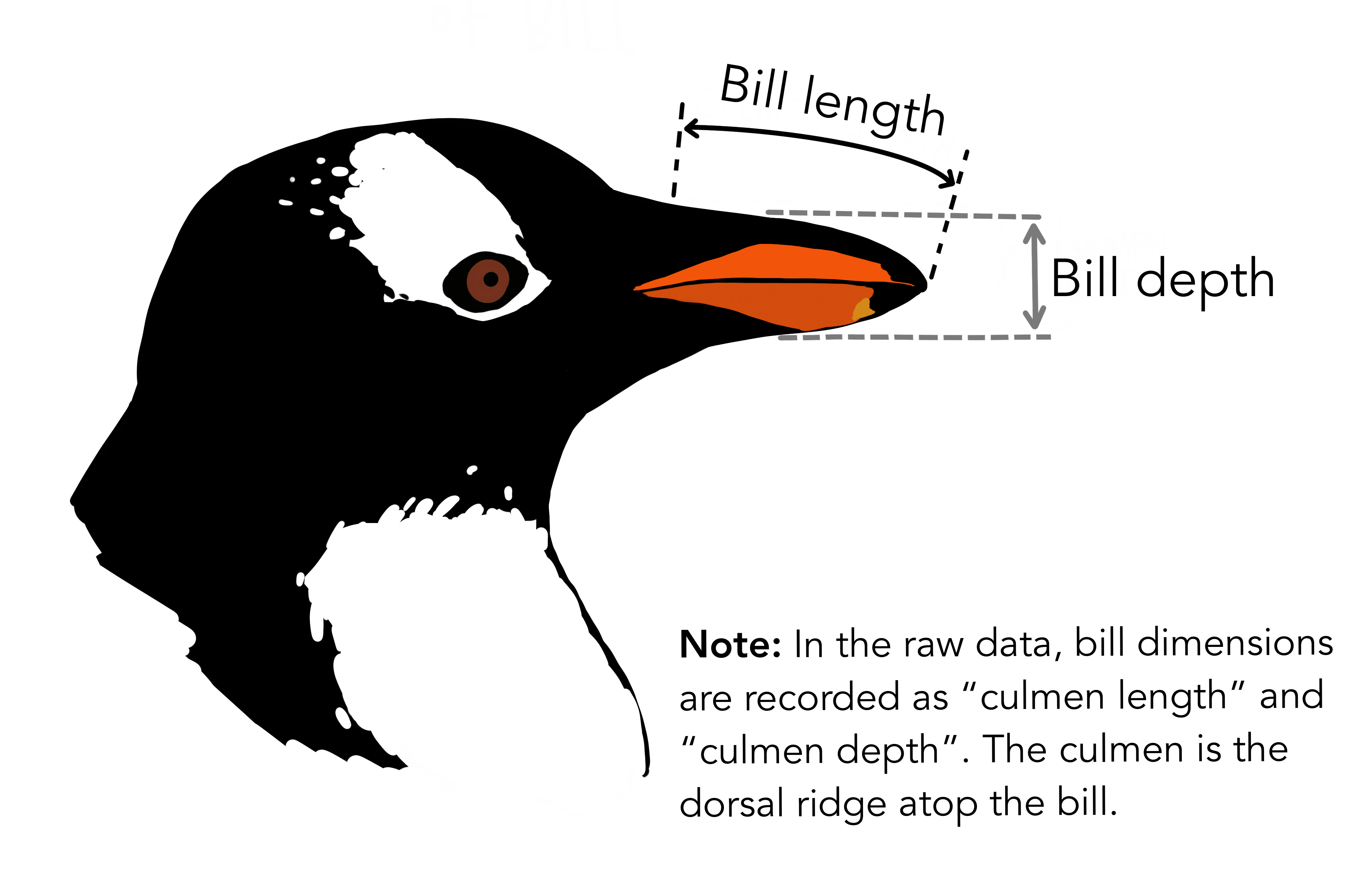
Artwork by @allison_horst ↩
-
PDF Version - Statistics by Intercomparison by Francis Galton ↩
-
The pseudonym ‘Student’ came about as workaround for the policy against publication of work under one’s own name while employed with the Guinness Brewing Company at this time. ↩
-
Gorman KB, Williams TD, Fraser WR (2014). Ecological sexual dimorphism and environmental variability within a community of Antarctic penguins (genus Pygoscelis). PLoS ONE 9(3):e90081. https://doi.org/10.1371/journal.pone.0090081 ↩
-
Cox, D. (2006). Principles of Statistical Inference. Cambridge: Cambridge University Press. doi:10.1017/CBO9780511813559 ↩